HOT MESS FOOD TRUCK

PROJECT TYPE

Brand Identity, Logo Design

TOOLS

Sketching, Adobe Illustrator

WEBSITE

www.hotmessfoodtruck.ca (WEBSITE PENDING LAUNCH)

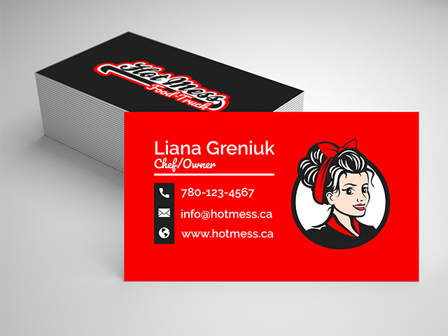
Hot Mess Food Truck is a privately owned mobile food business, that is in need of a fresh new look to their existing brand identity.

They wanted to update their logo to be more on point with their companies image. which can be used on all print/digital marketing, menus and social media platforms. The client wanted to convey an image to their customers of a retro, 50’s diner type motif that celebrates their all female staff by creating a mascot in a family friendly pin up style, while maintaining their existing colour palette of red, black, grey and white.

To achieve this goal, this project required me to create a custom designed vector logo, that can be used cross platform for their marketing needs (print, social media etc). Using Adobe Illustrator I custom designed the pin up girl first by sketching out various faces and bodies for client approval, then eventually directly in illustrator with the intent of this being used as the decal on their truck as well as the main banner logo for their website.

In addition to the mascot logo, I also created a secondary typographic logo that can be paired with the mascot or used on its own for use with different printing needs (letterheads, napkins, discount cards) that the mascot logo may not be useful for.

Hot Mess Illustrative Logo (Black Outline)

SOUND 360°

PROJECT TYPE

Concept: Logo Design

TOOLS

Sketchbook, Adobe Illustrator, Photoshop

PROJECT BRIEF:

As part of the 30 day logo challenge I took part in, I was tasked with creating a logo for a hardware startup that develops speakers that can map 360-degree videos onto stereo speakers for interactive events.

To achieve the goals for this project, I needed to complete the following requirements as requested by the client:

  • Needs to visually convey the Speaker’s 360-degree feature.
  • Visually represent the vastness of space and sound.
  • Will mainly be used on a black background.
  • Uses Circular Geometry design conventions to align with clients other brand assets design aesthetic.
  • Uses a font inspired by science fiction and modern sans-serif aesthetics.

As you can see in my design, I created a logo that uses a sans-serif, science fiction vibe font with simple circular geometric graphic, to visualize not only the speakers 360-degree sound, but as well the vastness of space and sound. I also tried to convey how sound moves by giving the logo an outward swirl effect showing it expanding into the vastness the space.

I chose the colour combination of neon blue and purple to give it a futuristic feel amongst the black background as blue is often associated with the feeling of precision and purple is a very rare color in nature; some people consider it to be artificial. I chose white as the font colour to reinforce the feeling of cool, cutting edge technology, while also allowing for more visual pop on a black background.

Overall I think I achieved the goals for this project and I loved the design so much I’ve included it into my portfolio as it happens to be one of my favorite more recent designs.