PROJECT TYPE
Branding | Logo Design
TOOLS
Sketching, Adobe Illustrator, Microsoft Word
Certified Training and Consulting is a privately owned, safety consultant organization that was unhappy with their existing brand identity and logo. They were looking to refresh their brand identity they use on all their print/digital marketing and social media platforms and update it to something that was easier to read, modern styled and professional looking. Their only requirement was they wanted a clear and easy to read font, and to incorporate their existing blue & grey colour palette.
As part of their branding I wanted to create something that symbolizes the 4 key values of their organization:
Health & Safety
Positivity
Efficiency
Accountability
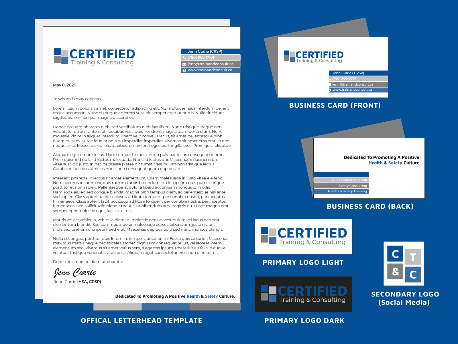
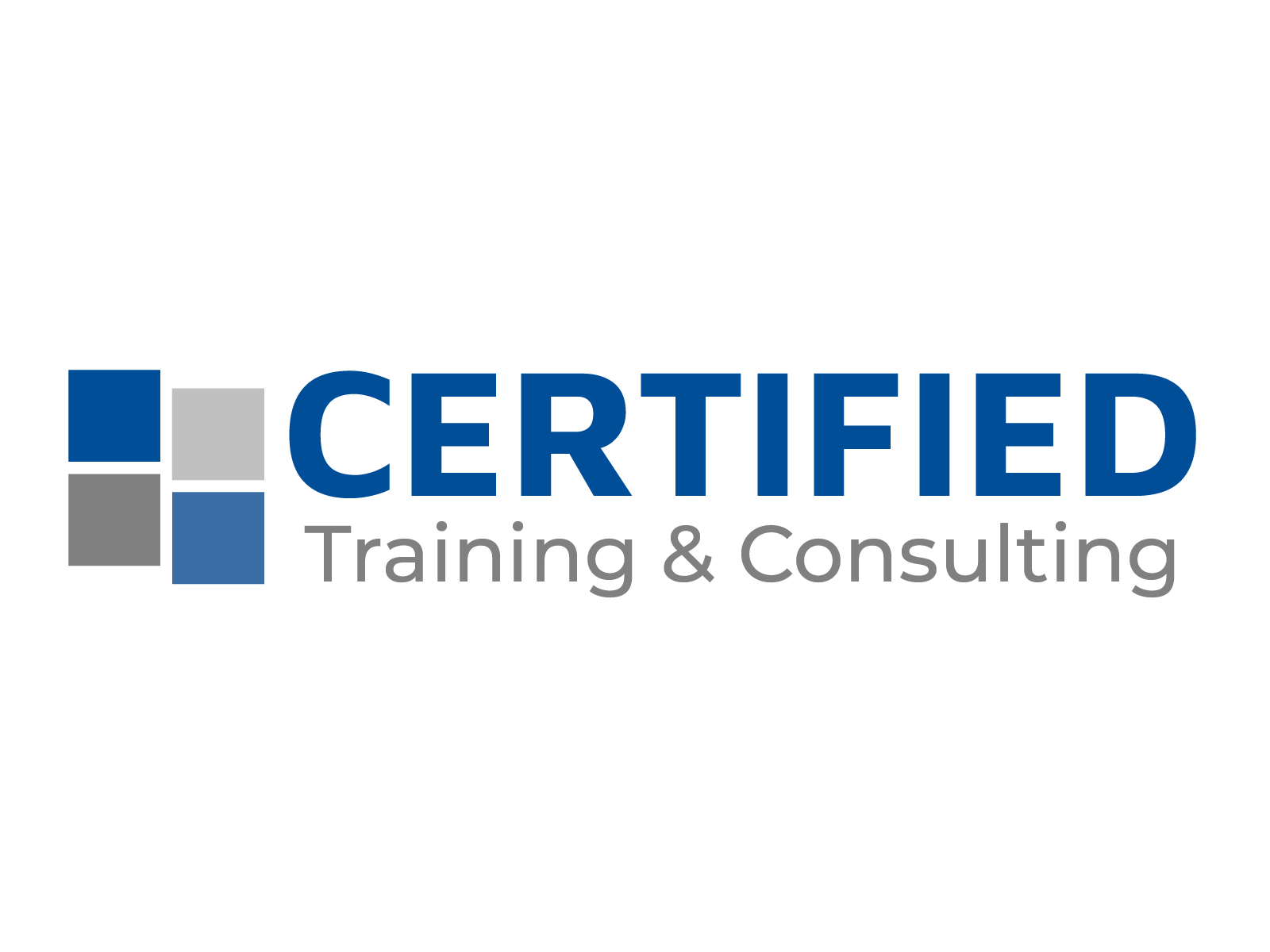
To achieve the end goal of this project, I created a branding package built around those 4 values, that can be used across all marketing platforms (print, web, social media etc). Using their brand style guide and chosen colour palette, I created an easy to read, sans-serif Wordmark logo. Along with the Wordmark logo, I created a secondary simple 4 block graphic element that can be paired with it or used alone for social media. Each block is meant to represent each one of the values using each colour of their chosen palette.
Using the combined logo and brand style guide as reference, I then created a customizable letterhead, as well as a business card and some social media banners and graphics. As you can see this gives their overall brand a cohesive, easy to use and simple design aesthetic.
