PROJECT TYPE
Print Design, Sportswear
TOOLS
Sketchbook, Illustrator, Photoshop
WEBSITE
View the YEG Crazy Pineapple Slo-Pitch Facebook Page
The Edmonton Sports and Social Club or ESSC was established in 2004 and has been providing adults with the best co-ed, multi sport experience ever since. In 2019 I was given the opportunity to design a sports team logo for the Crazy Pineapple Slo-pitch team that competes in the ESSC Slo-pitch league.
The chance to brand a sports team was an exciting prospect for me as there is more to a sports logo than meets the eye. A sports team logo is not just a nice image that accompanies the name of your team. It needs to symbolize more than just the name, it needs to give a sense of belonging, boost stamina and morale, and encourages support among team members and their fans.
To achieve the goals for this project I needed to complete the following requirements as requested by the client
1. Keep it Simple: Ones people can recognize as soon as they see it.
2. Scalable: A great logo should be simple enough to be able to be scaled down or up and still look good on all our merch.
3. Memorable / Impactful: A great logo should be impactful and capture the spirit of the Crazy Pineapple Team.
4. Builds Team Identity: The logo should build a sense of belonging while creating loyalty and support.
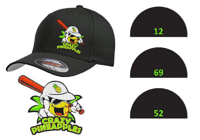
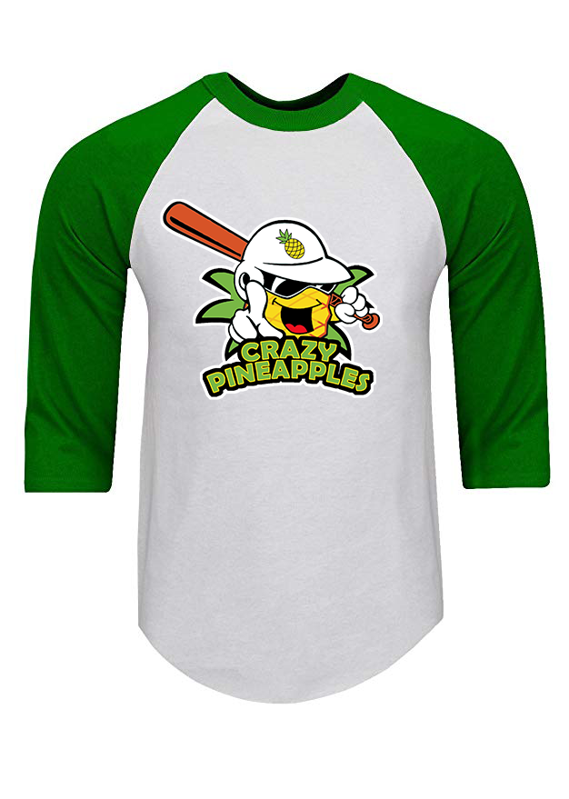
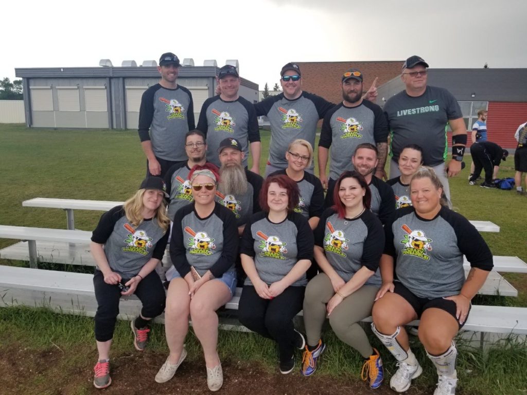
Using Adobe Illustrator I went to task creating a logo that focused on those 5 key requests. As you can see, the finished result is a well designed logo, that is easily recognizable, can placed on a variety of platforms, from clothes (T-shirts, ballcaps, etc) to online sources (Facebook, Instagram etc) and strongly represents the identity of the team.
There is no better “spokesperson” for your team than a clever, powerful logo. It’s a great way to get noticed and reach out to supporters, sponsors, and other members of your community.